
Lounge, living room, sitting room, parlor, front room, drawing room, morning room, salon… Whatever you call your living room, it is a truth universally acknowledged that the principal reception room should reflect warmth, welcome, and one’s personality.
But how do you create your own little personal haven in a room that’s likely to get trashed by the kids?
The natural choice, of course, is dark color – dark walls, dark carpets. Because – let’s face it – they hide a multitude of sins.
But who wants a dingy, dark, lifeless living room?
Welcome to contrast. Introduce light into dark spaces (and dark into light). Create style choices with bold tones that elevate even the most boring of white boxes.
So, put your feet up, grab your favorite warming drink, and dare to be inspired.
Elevating a white room
White is for everyone – as long as you choose wisely. And a fresh coat of brilliant white paint is generally one of the cheapest ways to transform a room.
If you’re painting over a color (or a wallpaper), you might need several coats for full coverage, but it’s the easiest way of adding a sense of space to small rooms.
White is calming yet energizing. You might think that white lacks personality, but wait till you see this:
Courtesy of Pinterest
This beautiful room makes excellent use of white walls to reinforce the height of that fabulous arched ceiling. Of course, your living room is more likely to have square corners – but the principle is precisely the same.
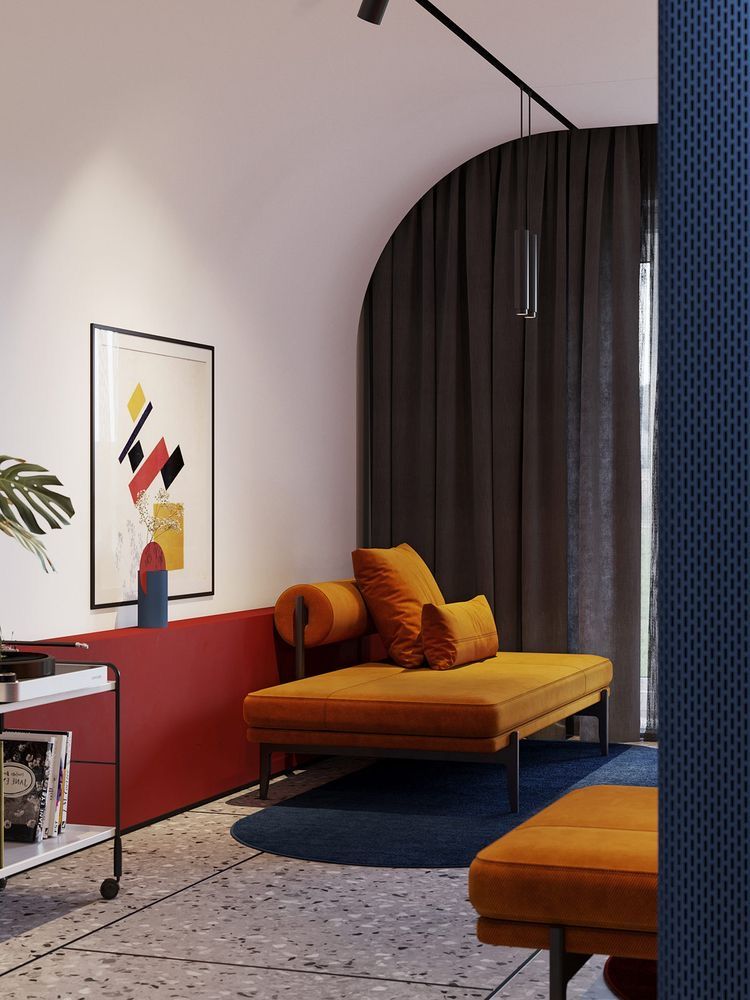
This is a color palette of earth tones: deep, robust reds against an opulent burnt orange that blends, contrasts, and warms the space against the boldness of the white. The charcoal grey curtains add foundation to the boldness of the orange – without it, it could look out of place.
This earthy palette echoes in the wall art – an abstract geometry that adds quirk to this funky, beautiful room.
The stone-tiled floor is an excellent choice for families – easy to clean and keeps the room cool during the summer as long as the climate is right.
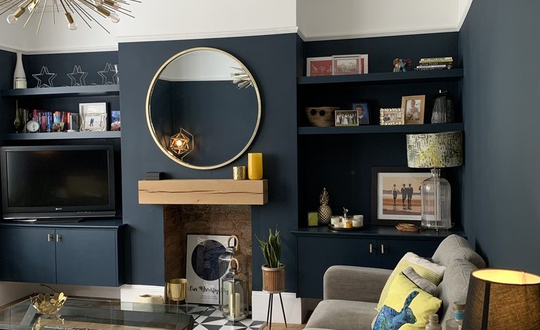
The Deep Strength of Dark Tones
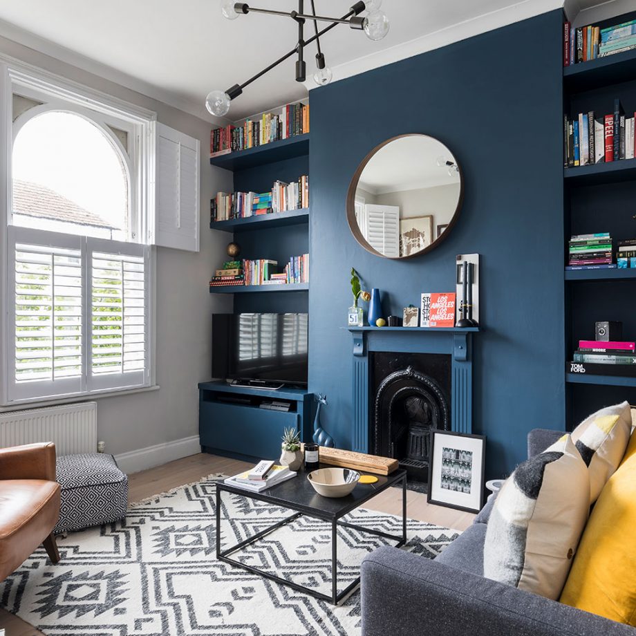
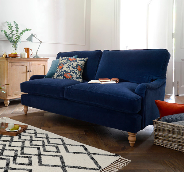
Deep rich blue walls against white
If brilliant white isn’t your thing, you might want to warm things up with a shaded white, like this beautiful linen-tinged neutral. However, the feature wall in this gorgeous living space breaks up the neutrality of the linen.
The deep, rich, contrasting blue contrasts against the warming (and forgiving) surrounding walls, transforming what could be a boring box into a sophisticated boudoir.
The geometric patterning in the rug and the footstool brings much-needed design interest – again reflected in the framed print by the beautifully restored fireplace.
There’s a clever use of contrasting shapes here as well. The deceptively cuboid coffee table, the sharp angles of the sofa arms, and the geometric precision of the shelving are all softened by a circular mirror. Pair that with the arch of the window and curvature of the fireplace, and you have a great contrast of form.
And while sharp corners are best avoided for child-friendly living rooms, you could easily substitute the square coffee table for a circular one.
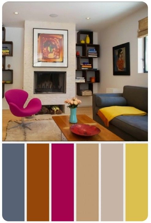
Never Be Afraid of Color
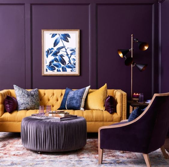
Deep, regal purple and mustard
OK, so this is not a room regularly populated by children. Anyone who dares introduce velvet to sticky fingers will regret it within hours.
But the choice of furnishings isn’t the issue here – we’re exploring the contrast of bold tonal options.
Of course, the principal tone is the stunning, sumptuous purple of the walls and the armchair. But this room would undoubtedly be dark and energy-zapping without that pop of mustard yellow.
Now, we’re really talking the tones of the 70s, here – mustard? While it may have been confined to the fridge for the last thirty years, it’s back with a bang. And you can see why.
What works so significantly, though, is how the base and the feature colors are combined. Note the purple scatter cushions on the sofa. Observe the blue of the wall art that pops back into the room through the feature cushions.
Sure, you’d have to be insane to choose a velvet coffee table with kids and Sunny D on the block, but this funky fusion of rich contrasting colors creates a living room you’d be proud to show off to your guests.
Surprise Yourself with Salmon
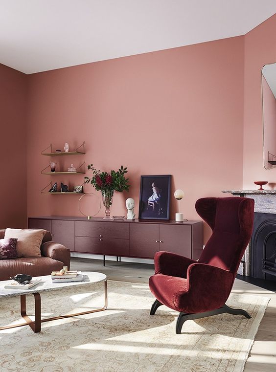
Salmon pink, anyone?
Just look at the striking contrast between the lavish matte of the flat pink with the crispness of the brilliant white ceiling. Notice how the salmon pink reflects the light differently in corners; adding a warming vignette that softens the right angles.
You’re probably wondering if you could live with salmon pink? But it’s the neighboring tones of reds and browns that really settle the garishness of the base tone here.
Salmon pink blends with similar hues of the jammiest merlot in the armchair and the sideboard’s deep, dark mahogany. The sofa continues this tonal journey with shades of caramel latte.
You might think that it’s contrast or nothing, but these tonal blends bring cohesion. This is a super-calming space for relaxation with bold colors that elevate the neutral whites and beiges of the rug and the coffee table.
Feature Furniture
Royal blue sofa
This would be a rather dull space were it not for this gorgeous, plush couch bringing design interest to this bright and airy living room.
The walls are bright and white, while the floor and the sideboard bring much-needed earth-toned warmth. So, the royal blue of the couch becomes a central feature of the space – drawing the eye to the luxuriant cobalt.
But don’t overlook the pop of burnt orange in the couch-side cushion box – emanating into the floral cushion and the earthenware jug and fruit bowl sitting on the sideboard.
This is a confident design understatement – perfectly achievable in family homes and child-free havens alike.
Zoning with Contrast
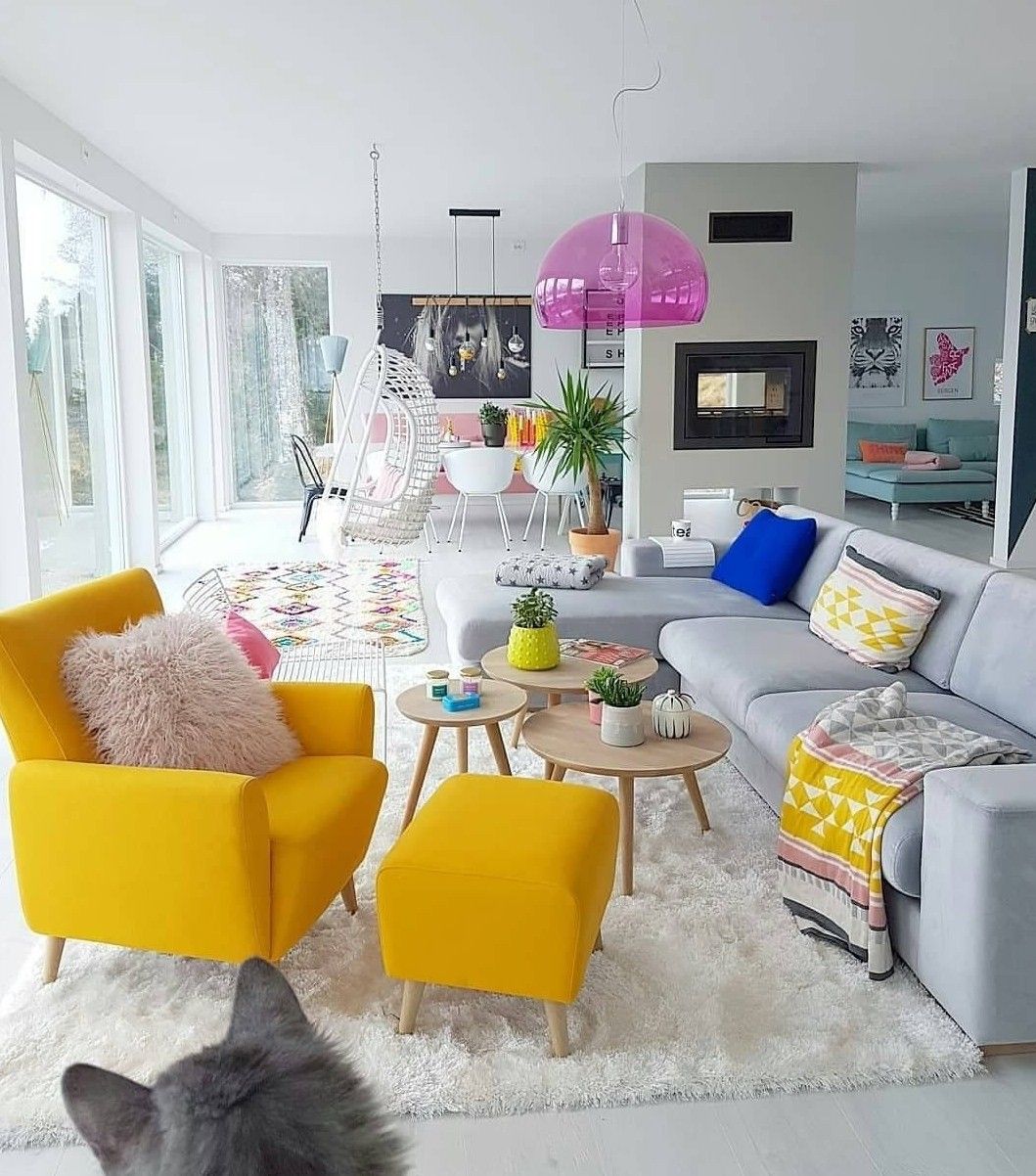
Sometimes it’s possible to be blinded by the white. But this ample, open-plan space uses contrasting colors in a particularly clever way.
If you’ve opted for open-plan, there’s always a danger that you live your entire in a single room. This space, however, could be a wash of white – and it almost is. But if you look carefully, you can see how a different contrasting tone defines each corner of the room.
The living room zone is mustard (that mustard again!), with pops of electric blue and teal, while the distant dining area is unashamedly embracing baby pink (and some trendy wall art). The far corner snug invites in the cooling tones of mint, giving character and calm to a zone dedicated to relaxation.
But what’s most clever here is the recurrent motif of pink that teases in each zone, bringing unity to the entire palette. It’s a subtle touch, but it really does work to bring this vast space coziness and calm.
Contrast to lift your living room
So, there you have it: contrasting tones that lift living rooms. Make your lounge brighter with brilliant white, but tone down the glare with a striking feature color or add zones to huge spaces to introduce coziness.
Never be afraid of bold color. The prospect of mustard yellow is much worse than the reality, and burnt orange brings warmth and style to any living room – or whatever you might call it.


Leave a Comment